Improving Elective Surgery Experience
Kaiser Permanente
Overview
I worked with a small team to redesign Kaiser Permanente's elective surgery page which provides a digital platform for patients to receive preparation and post care information about their surgery. This page is a part of KP northern California region website, My Doctor Online which serves 4.5M+ members.
The Problem
In the northern California region, more than 40k elective surgeries are performed each year. However, KP was facing high cancellations due to patient's lack of preparation. The previous experience had four major problems that contributed to the high cancelations: too much information, lack of visual hierarchy, fragmented UI, inaccessibility, and lack of standardized proceess.
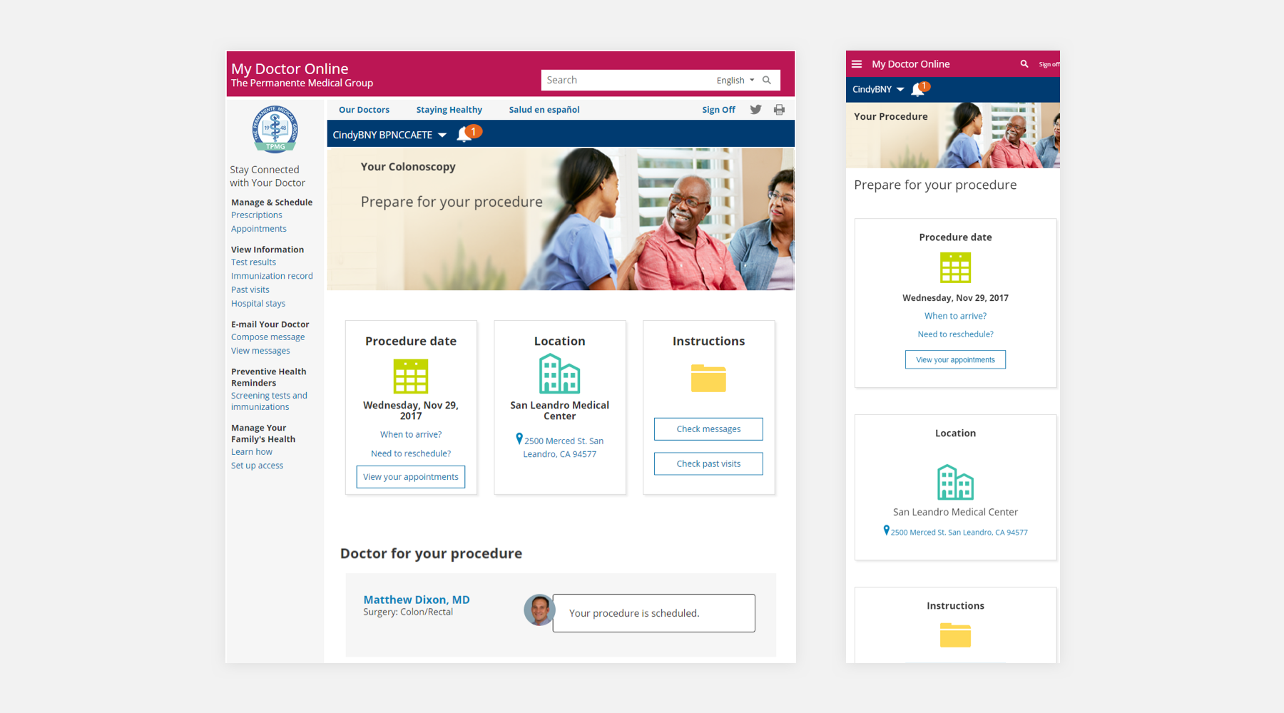
Too much information and lack of visual hierarchy
Some patients lacked understanding of surgery preparation due to too much information and poor visual hierarchy.
Fragmented UI
Users were seeing two diffrent designs between KP national and KP northen California site. This created a confusion and loss of users trust in the brand.
Inaccessibility
Lack of html semantics was causing broken keyboard navigation, focus shiffing, screen reader descritptions and navigation. Also, some design elements didn't have sufficient color contrast.
Lack of standardized proceess
There was no single source of truth for their surgery information (e.g., some patients received brochure and weren't aware of the surgery page until they received the outreach email).
Business Goals
- Provide single source of truth to educate and prepare patients before surgery.
- Reduce surgery cancelations due to lack of preparation.
- Increase patience satisfaction.
- Easily customizable content.
The Users
The surgery page is primarily used by patients in their 50s or older who may not be tech savvy. UX research revealed that the information users identified as important to know before surgery was how to prepare, dietray information, and recovery time.
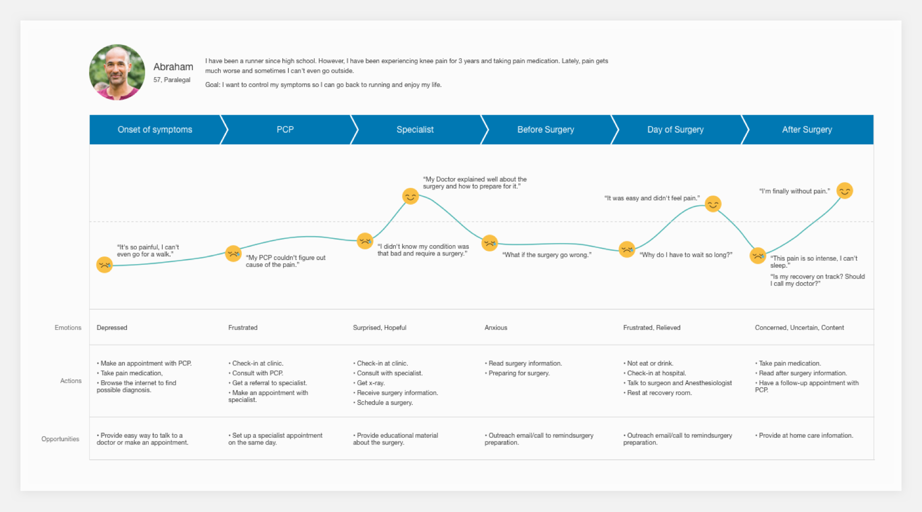
Solution in the redesign
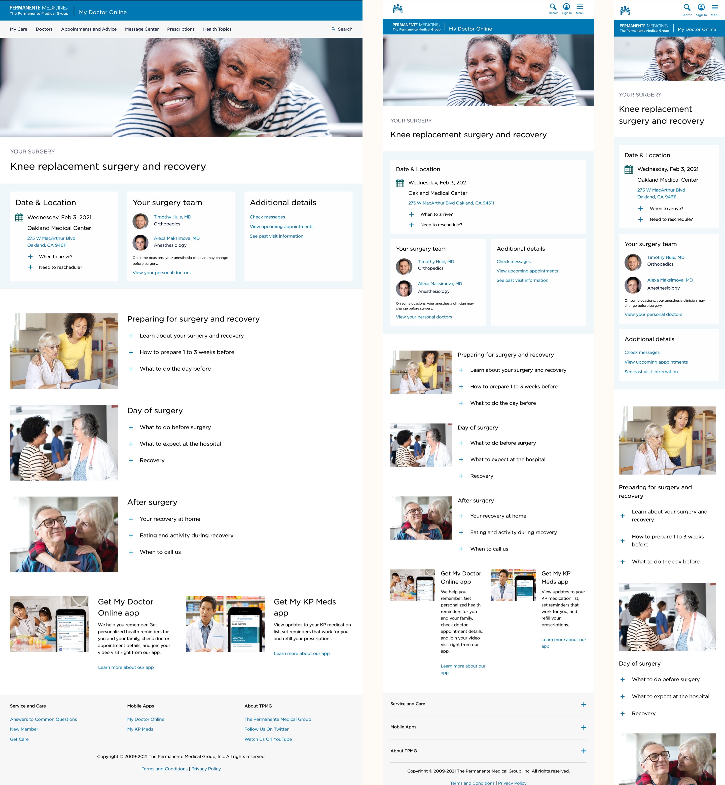
Simplied header and hero
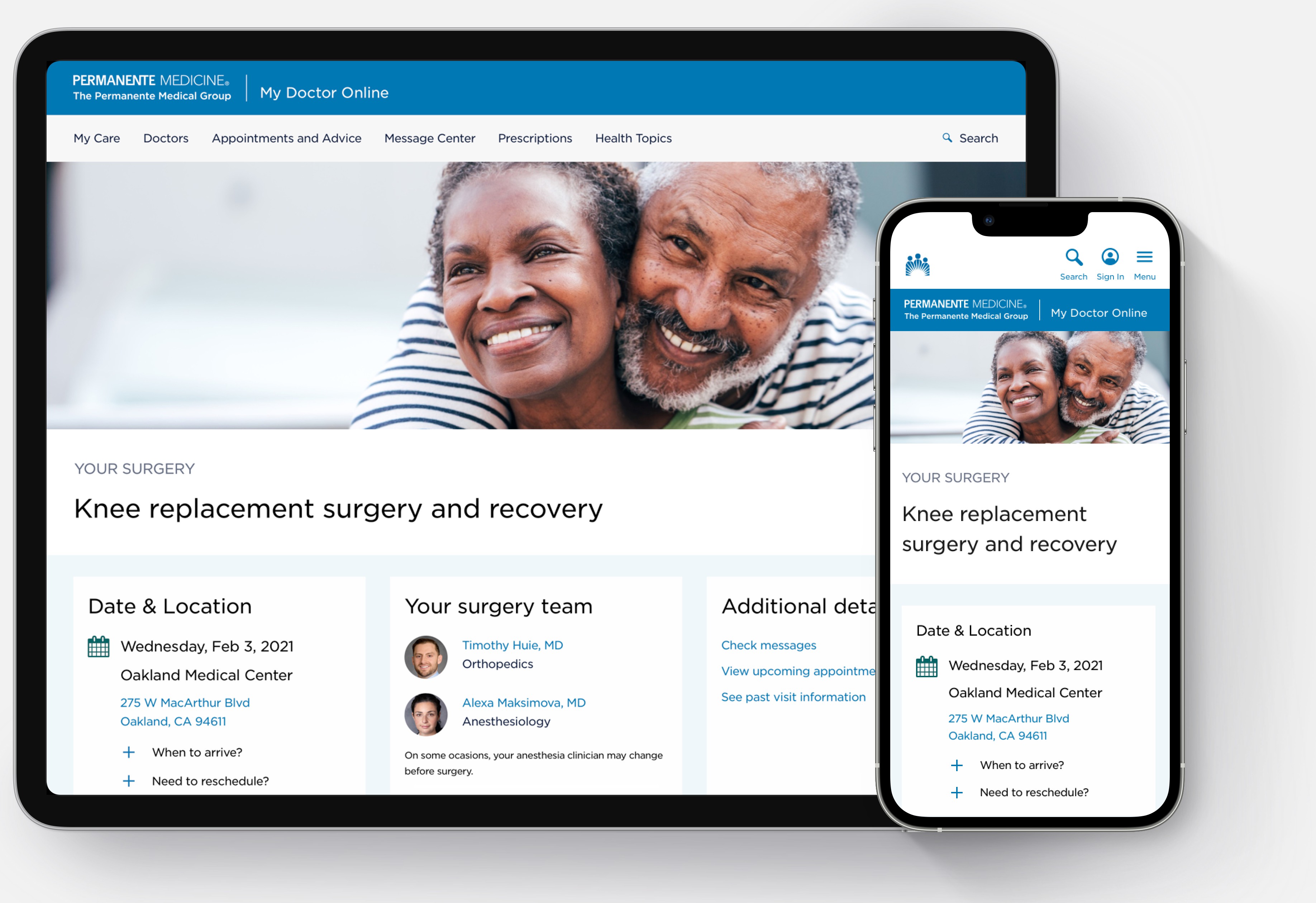
The new header reduced the number of links while they are still accessible to reduce cognitive load. It also has the consistent look and feel with the KP national design. The new hero image is more natural and conveys positive message.

Cleaner and more organized personalized section
The large icons in the old design were distracting user's attension instead of helping them find information. The information hierarchy didn't meet user's expectation. We cleaned the section by removing the unnecessary icons and combined date and location sections into one. By adding blue background, it created clear seperation between personalized section and other sections.

Discoverable and engaging instruction
Removing the icons which don't convey much meaning and adding images that portray the surgery journey helped people find information easier. The new toggle design is easily accessible by keyboard.

Final Design
The final design is consistent with the KP national design and provides the same experience across all deveices.
User Testing Findings
After we finalized the design, we conducted the final round of user testing. The participants stated the new design was clean, simple, well organized, and easy to navigate.
This gives me what I was interested in - what to expect or not expect
I really like the photos - calming, I like that patients were not shown by themselves
Super helpful to have it all in one place and not have to look through a stack of information that I got 4 weeks earlier at consultation
Impact
- Significant increase in time spent on page
- Lower cancellation rate
- Higher patient satisfaction score
