Optimizing Checkout Experience
Pampered Chef
Overview
The aim of the redesign was to enhance user experience and make the checkout process more streamlined and enjoyable.
User Pain Points
- It was nearly impossible for mobile users to complete the checkout process.
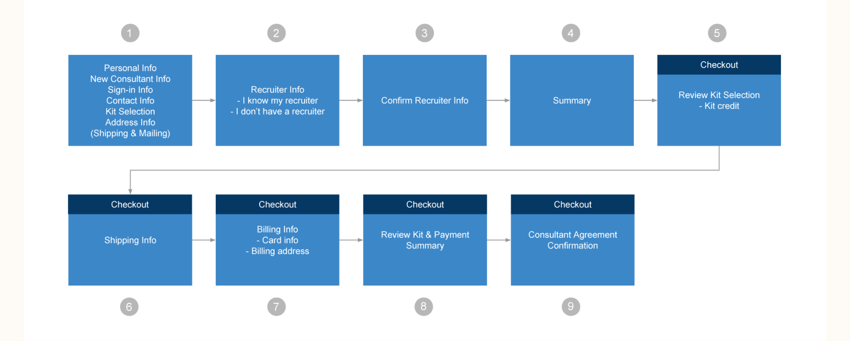
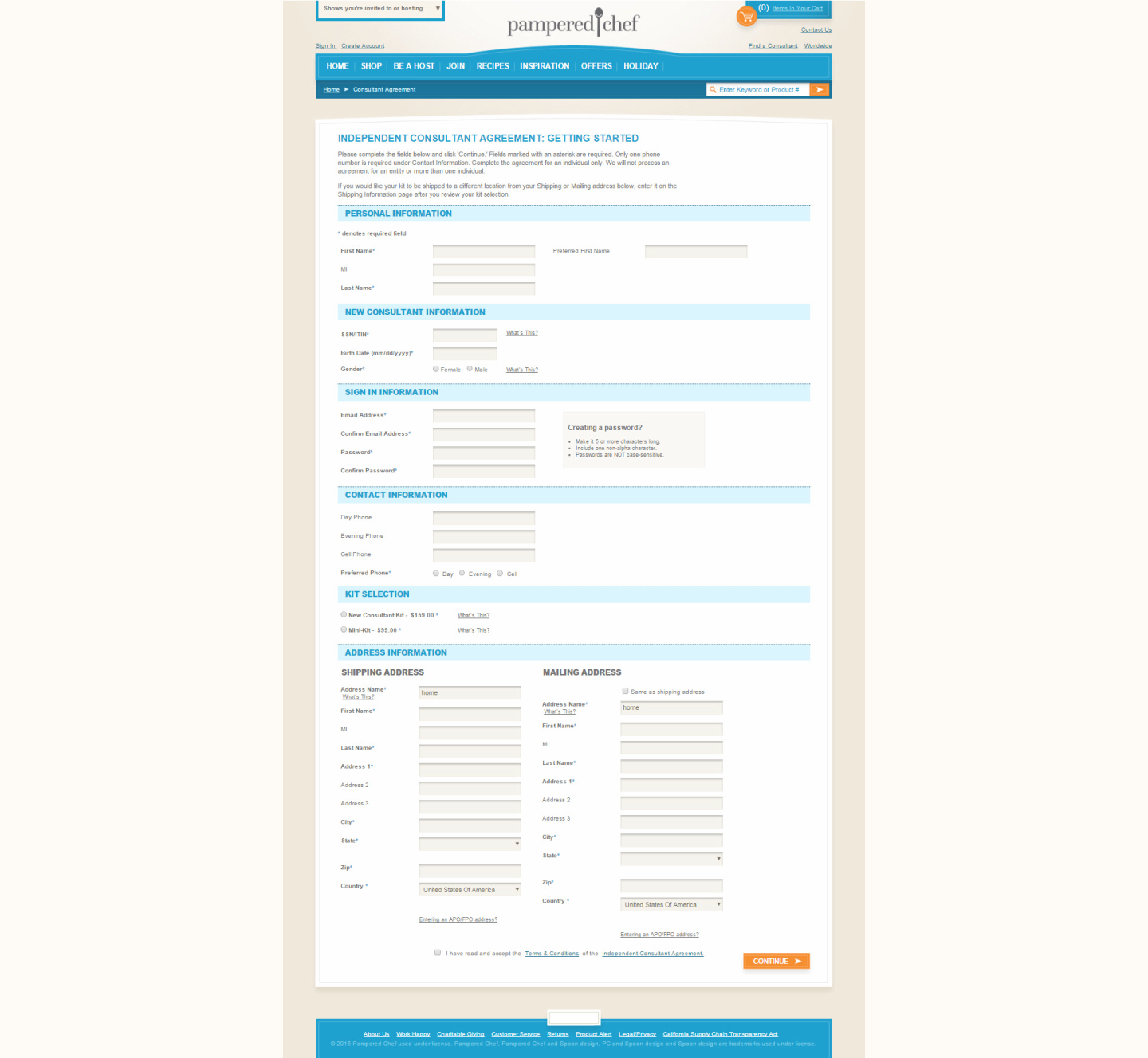
- The checkout process consisted of 9 ages, often asking users for redundant information.
- The look and feel of the page was outdated and didn't follow brand guidelines.
Business Goals
Pampered Chef knew their high checkout abandonment rate affected their business. Therefore, to lower abandonment rates and improve revenue, Pampered Chef sought to redesign their checkout process and improve user experience.
Old User Flow & UI
Competitive Research
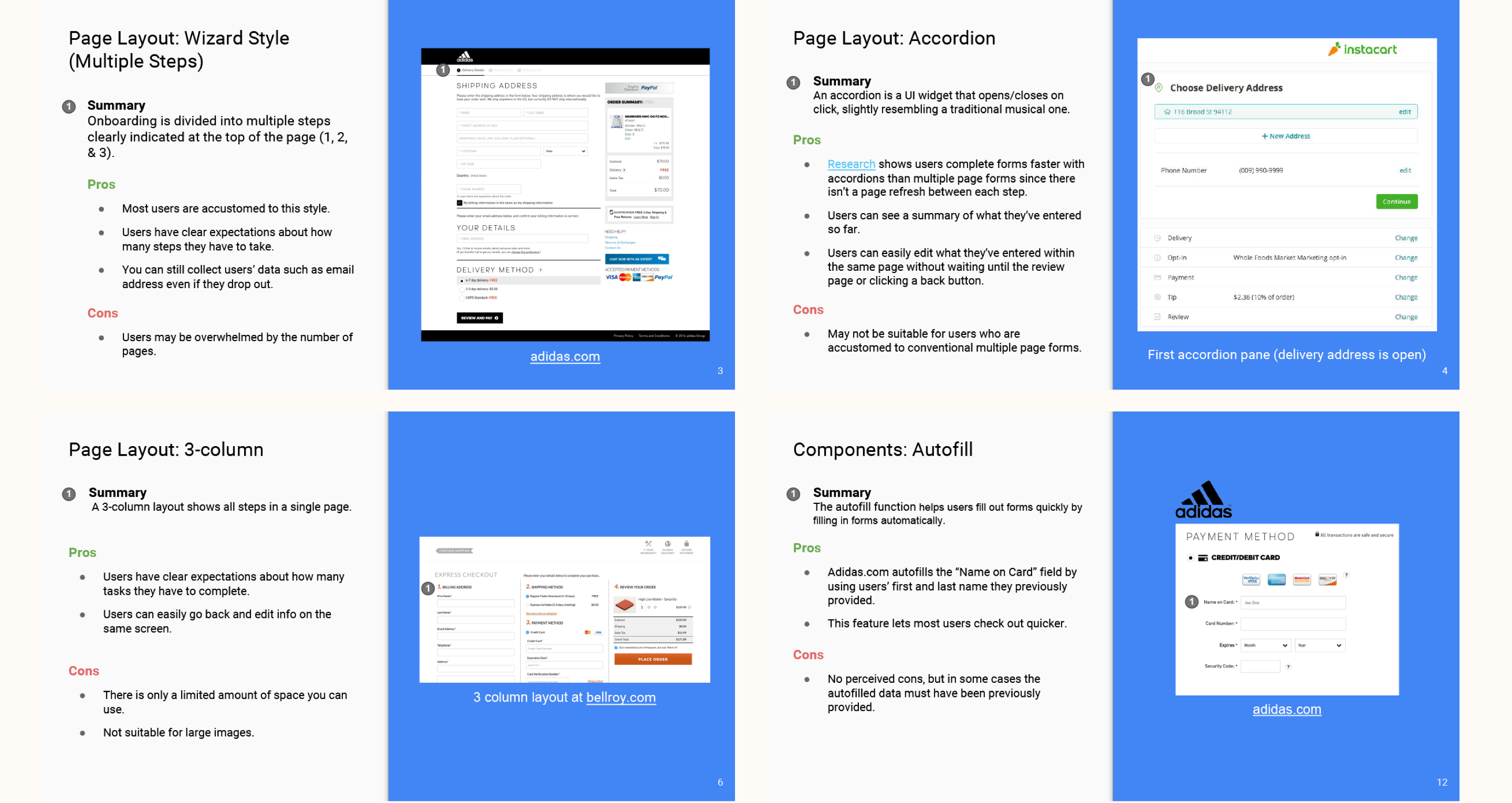
We conducted competitive research on a variety of checkout pages and presented our comparative analysis to Pampered Chef.
New User Flow
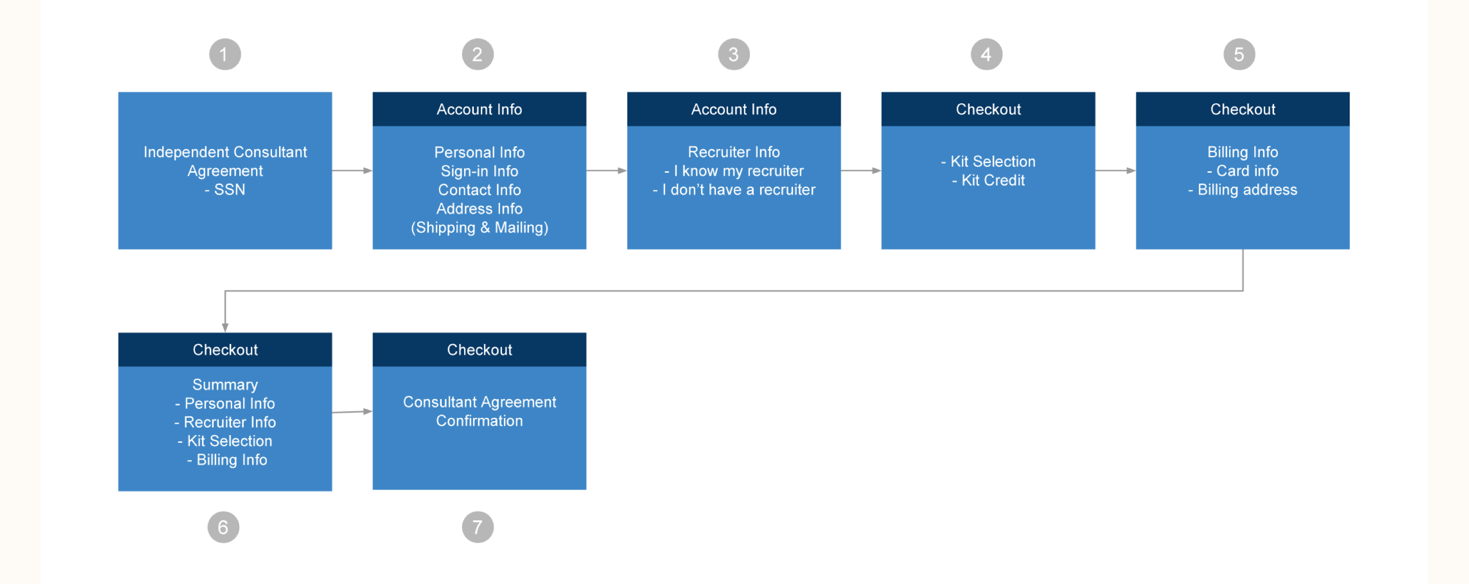
Initially, we cut the old 9-step flow to 5-step flow by eliminating redundancy and unnecessary information. However, PC had issues with the new 5-step flow since it required additional backend work. To eliminate further backend work, we came up with a new 7-step flow.
New UI
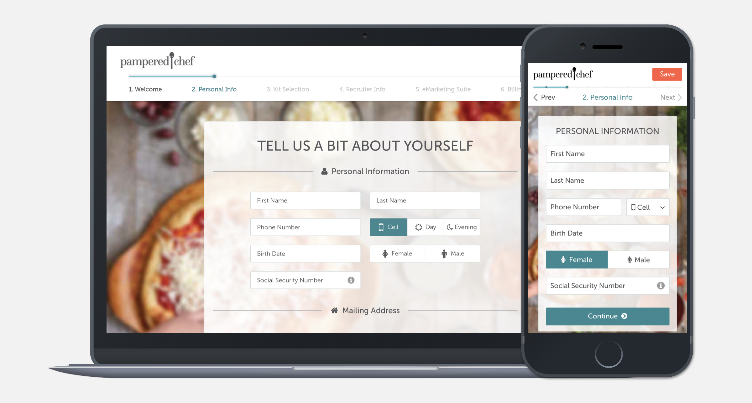
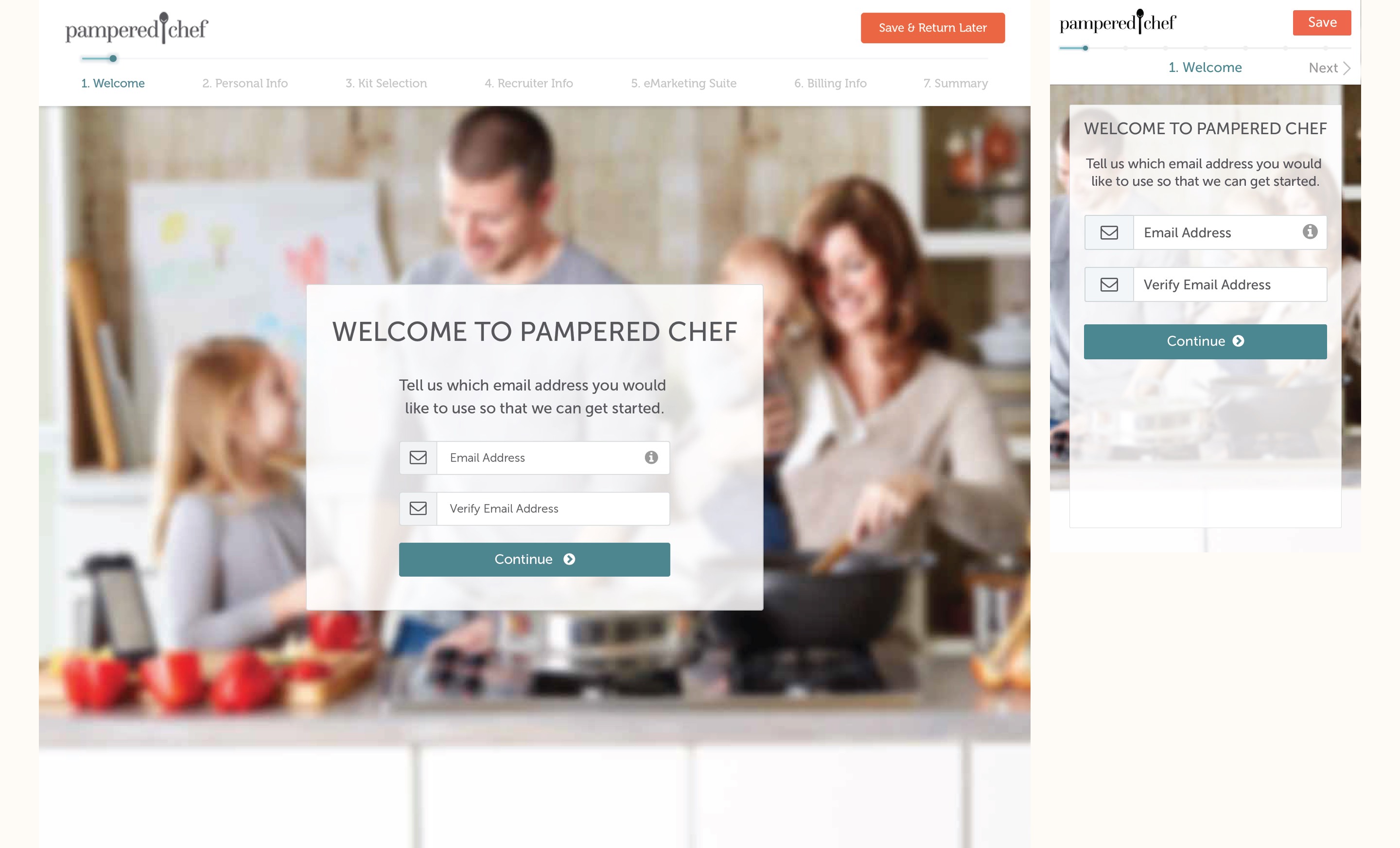
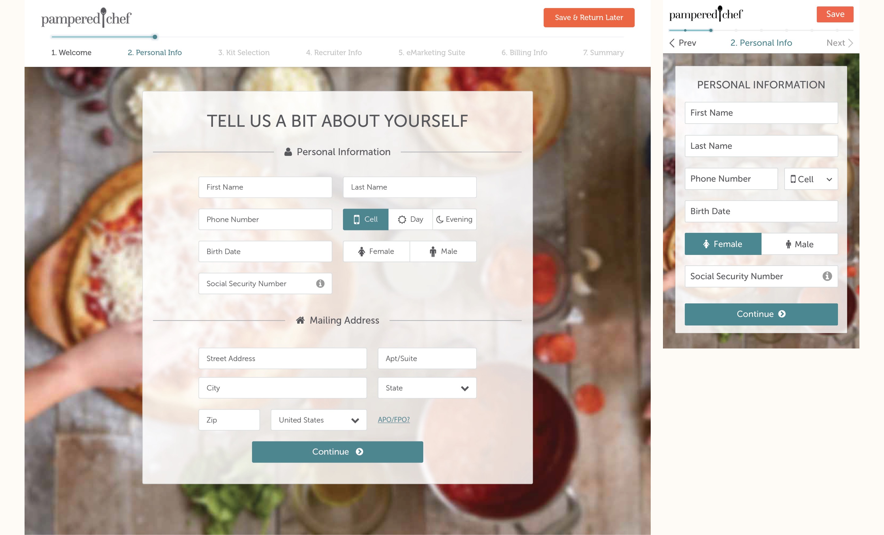
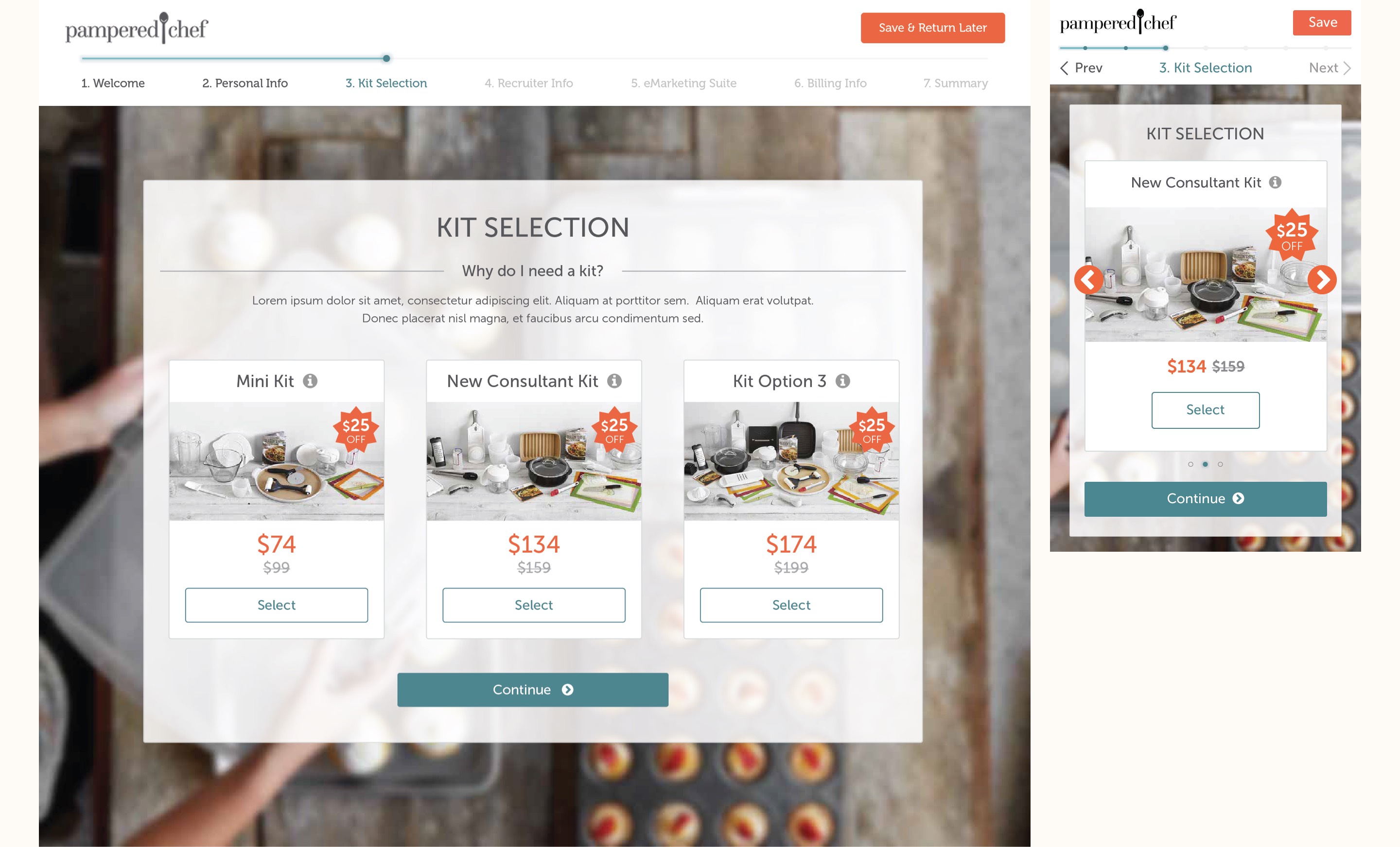
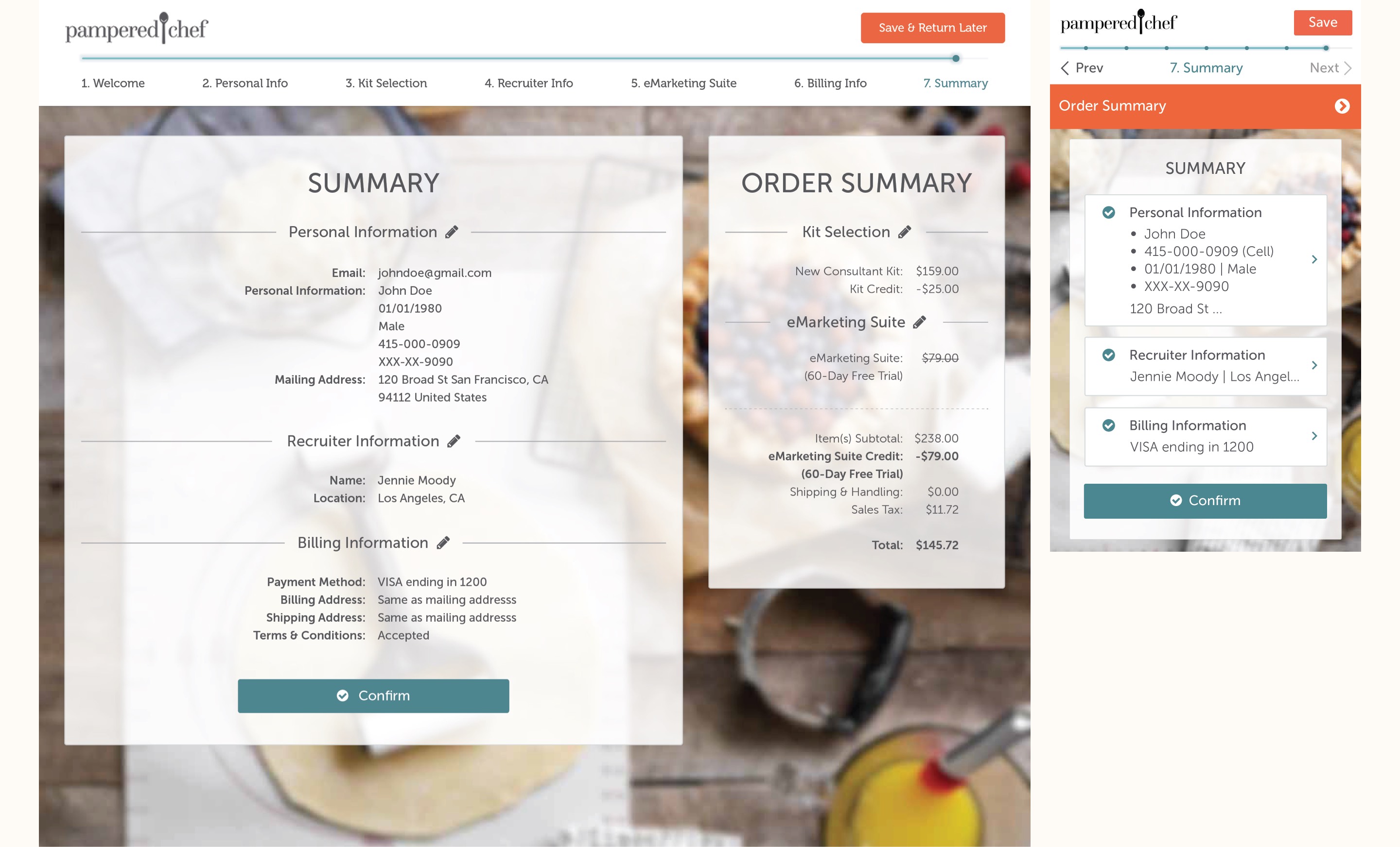
- The new design was fully responsive across all devices and met accessibility standard.
- The progress bar was placed on top of the page to clearly indicate to users their progress and steps left to complete the process.
- Background images of a fun cooking process were utilized to make the checkout process more enjoyable.
- A “save” button was added so users can resume the checkout process at a later time.
Result
After we successfully launched the checkout page, conversion rates increased, and the number of customer service inquiries dropped significantly.
